Okay, folks, buckle up, because BMW just pulled a fast one on us. You know how companies love to "reimagine" their brand with a splashy, sometimes disastrous, logo overhaul? Well, BMW did… something else. They've unveiled a subtly redesigned logo. And I mean *subtly*. Like, blink-and-you'll-miss-it subtle. Truth be told, I almost missed it, and I write about cars for a living!
BMW's NEW Logo SHOCKS Fans! What Does It Mean?!
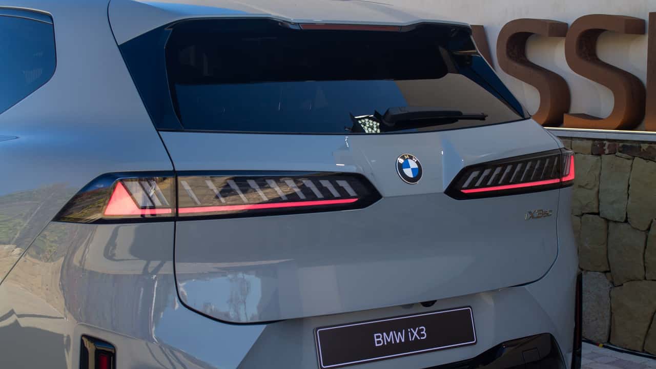
This isn't your typical "rip it up and start over" situation. This is more of a… gentle nudge. The kind of change you might not even notice unless you're staring intently at the hood of a brand new Beemer. It actually started popping up on the iX3 a while back, and there were rumblings, whispers in the automotive ether. But BMW only just officially confirmed the update. Sneaky, right?
So, what's different? Glad you asked. The biggest change is the disappearance of the chrome inner ring that used to encircle the blue-and-white roundel. The outer chrome ring is still there, thankfully, but it's been flattened out. It’s a more modern, minimalist look, I suppose. It's less "bling" and more "quiet luxury," which seems to be the direction everyone’s headed these days.
According to BMW design chief Oliver Heilmer, it's all about "preserving our heritage, but refining the logo." In an interview with BMW Blog, he explained that the letters have been reworked with a pattern similar to those found on watch faces. "The white surfaces are now closer to the outer ring," he added, emphasizing the flatter but textured design. I have to admit, I'm curious to see how that texture translates in person. A tactile logo? Now that's something.
But wait, there's more! BMW also teased an update to the M division logo, because why stop at one subtle change when you can have two? Details are even scarcer on this one, but expect a similar level of refinement. The new M logo is slated to debut on M models starting in February, aligning with the rollout of the updated BMW logo across their future lineup. So, keep your eyes peeled. And maybe carry a magnifying glass. You know, just in case. All in all, it’s a thoughtful evolution, not a revolution. Which, frankly, is a relief.
Comments
Please sign in with Google to post a comment
No comments yet. Be the first to comment!